ADLER & LUCHS
PROJECT TITLE
ADLER & LUCHS
Retail Design for an eyewear and hearing aid store
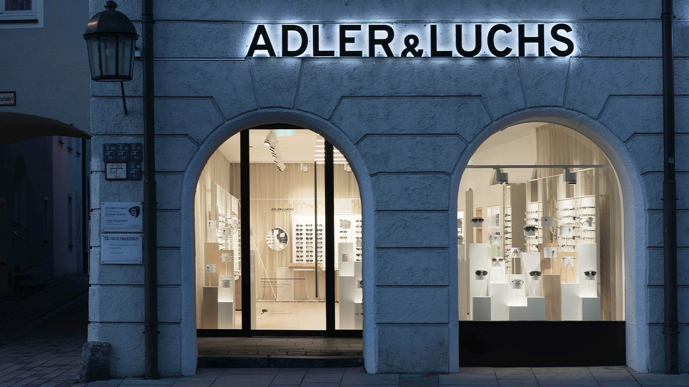
See like an eagle and hear like a lynx - this German expression gave the optical and acoustics store its name. Adler & Luchs enlisted our help to design a retail environment that created a sales and service space which prioritized the customer-first experience.
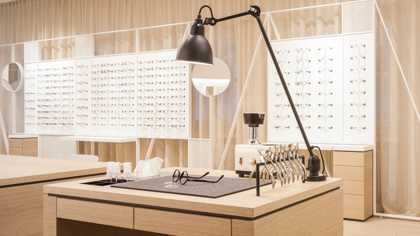
A light color scheme and custom fixtures were installed as a second layer over the historic frame, creating the perfect space for dedicated and attentive customer consultation and sales.
Project subline Project subline
et magnis dis parturient montes
nascetur ridiculus mus.
Retail Design for an eyewear and hearing aid store
See like an eagle and hear like a lynx - this German expression gave the optical and acoustics store its name. Adler & Luchs enlisted our help to design a retail environment that created a sales and service space which prioritized the customer-first experience.
A light color scheme and custom fixtures were installed as a second layer over the historic frame, creating the perfect space for dedicated and attentive customer consultation and sales.
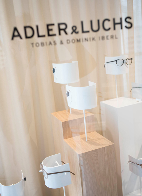
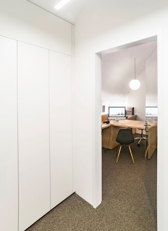
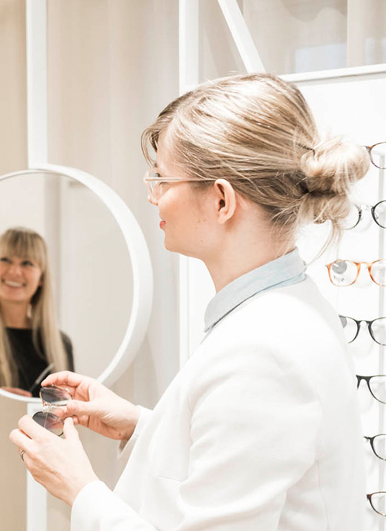
Adler & Luchs customers can browse displays as they enter directly into the salesroom. This fronts up the supporting areas consisting of an office, private consultation room and workshop. Curved walls and large windows, which previously created a visual uneasiness, offered little space for displays.
Adler & Luchs customers can browse displays as they enter directly into the salesroom. This fronts up the supporting areas consisting of an office, private consultation room and workshop. Curved walls and large windows, which previously created a visual uneasiness, offered little space for displays.
PROJECT TITLE
The answer was to build a second layer in front of the interior wall with recessed pockets for product display. The opposing wall is masked with a semi-translucent floor to ceiling drape, which softens the chaos of the window front. In front of the curtain, a free-standing display sets the specs optimally whilst providing a border for the room.
The answer was to build a second layer in front of the interior wall with recessed pockets for product display. The opposing wall is masked with a semi-translucent floor to ceiling drape, which softens the chaos of the window front. In front of the curtain, a free-standing display sets the specs optimally whilst providing a border for the room.
Project: Retail Design
Date: 2016
Client: Adler & Luchs OHG
Photography: Lothar Reichel
Project: Retail Design
Date: 2016
Client: Adler & Luchs OHG
Photography: Lothar Reichel
© 2020